Transform Your Instagram in Under a Minute: Best Glow Up Tips
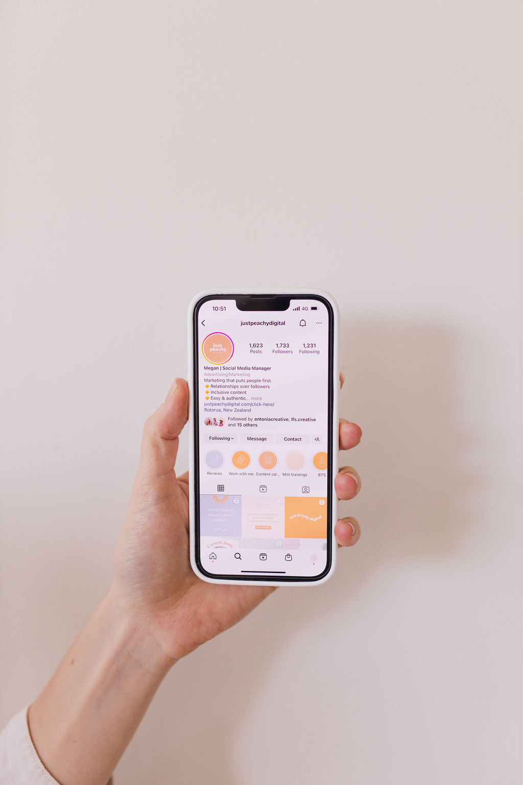
Want better reach and engagement on Instagram in just a minute? I’ve rounded up the best of my 60 Second Glow Ups for you! These are free content and profile audits I share with my community on Instagram, in just sixty seconds (or less!). In this blog, you’ll find tips to transform your Instagram including giving your highlights a makeover, boosting engagement, improving your Reels, and creating eye-catching graphics.
Let’s get into it and see how much of a difference these quick tips can make for your social media presence.

quick fixes to transform your instagram
Upgrade Your Instagram Highlights | with Amy Zambonin
Amy is a brand photographer based in Ottawa, Canada. She helps entrepreneurs to confidently share their business and show their magic.
Amy is using Instagram really well to promote her business. She’s obviously got beautiful photography to showcase, and I love her use of Reels to take her audience behind the scenes of her brand shoots.
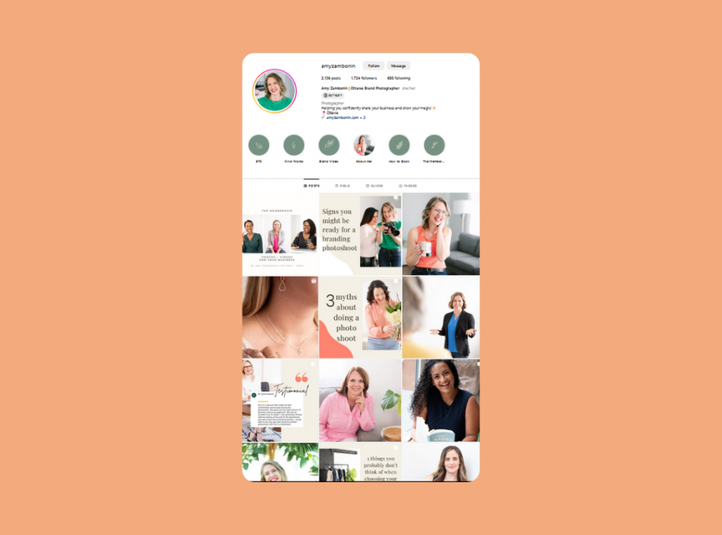
A few issues I’m seeing:
- Old highlights from years ago
- Highlights with too many slides (people just aren’t going to watch 20+ stories)
- Saving stories vs intentionally creating highlights
My tips for upgrading your highlights:
- Curate and update your Instagram highlights frequently.
- Remove any outdated slides or highlights with 10+ slides.
- Make your highlights like mini website pages that house all the essential info about your business (think: About, Services, Client Reviews, FAQs etc.)
Encourage Engagement On Your Posts | with Sunday Naturopathy
Gemma is a New Zealand-based registered Naturopath. She specifically focuses on women’s skin, fertility and reproductive health.
Gemma has a gorgeous feed, it’s so visually appealing and she does an incredible job with the aesthetic of her Instagram profile.
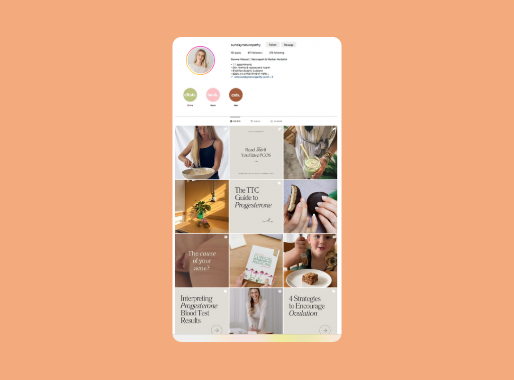
The issues I’m seeing are:
Gemma provides so much valuable information in the captions but there isn’t always an easy way for her audience to engage.
She also has brilliant messaging in her posts but some of it is getting lost in her captions or on the second slide of her carousels.
My tips for encouraging engagement:
- Give a call to action with every post to make it easy for your audience to engage (simply asking a question is a good place to start.)
- Grab your audience’s attention by putting an interesting title on your graphics.
Content That Tells A Story | with Emma Kate Wellbeing
Emma is a massage and wellbeing coach from New Zealand. She supports people to strengthen their mind, body and soul with massage, mindfulness and wellbeing coaching.
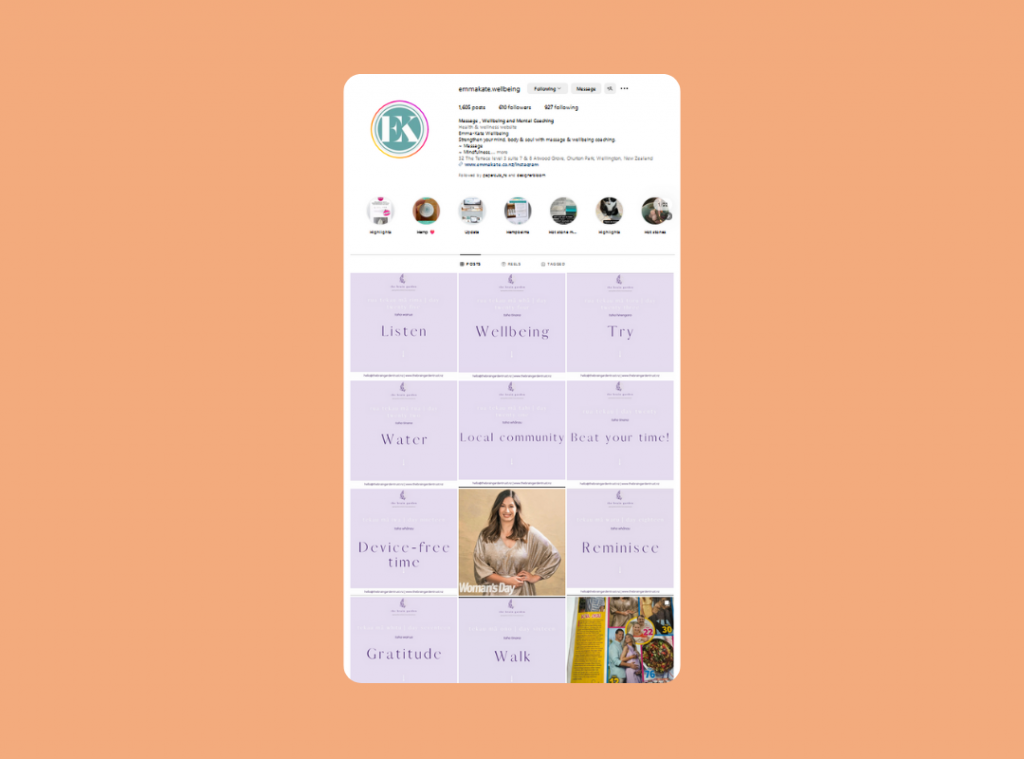
The issues I’m seeing are:
Emma’s posts are lacking structure which would help make them more engaging. There aren’t hooks to grab attention or calls to action to encourage conversations.
My tips for creating engaging posts:
Use structure to tell a story with your content ie. have a beginning, middle and end.
- beginning: a hook to capture someone’s attention, quickly explain why they should care & what’s in it for them.
- middle: deliver the goods, provide the value (eg. education, entertainment, inspiration.)
- ending: give them their next steps (eg. join the conversation in the comments, send you a message, read the blog post.)
Upgrade Your Reels Content | with Virtually Yours Farah
This was a first! I had never done a glow up for a fellow social media manager before.
Farah is a New Zealand-based Social Media Strategist & Manager. She supports small business owners to create socials that stops the scroll, attracts their dream clients and gives them back their time.
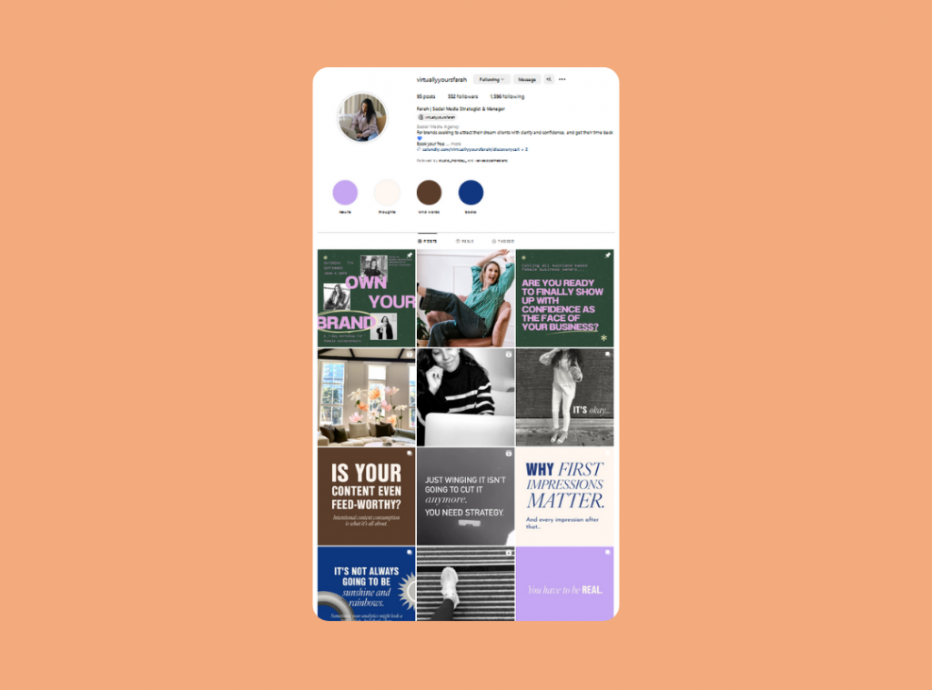
The issues I’m seeing:
Farah is mostly sharing b-roll videos (i.e. videos that don’t include someone interacting with or talking to the camera).
Personally, I’m not the biggest fan of these b-roll style videos where all of the information and value is shared in the caption.
My tips for better Reels content:
- Share the key takeaways from your post shared ON the video.
- Share more storytelling Reels that include multiple clips like “going to a networking event” or “spend the day with me” as I find those much more engaging.
Improve Your Graphics | with Glow For It Ash
Ashley is an Australian personal trainer, personal growth and nutrition coach. She helps women improve their relationship with their mind, body and soul.
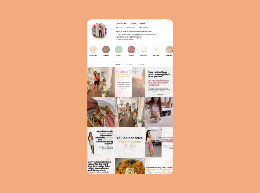
The issues I’m seeing:
Ashley shares a lot of emotive and story-driven posts but this means that a lot of her graphics are very text heavy. People tend to get overwhelmed when they see a wall of text, and instead of reading it, they swipe past.
My tips for improving your graphics:
- Reduce the amount of text on your graphics.
- Choose fonts, text sizes and colours that are easy to read.
- Create titles that will grab people’s attention.
Recommended reading: 7 common social media mistakes and how to fix them ASAP
Bonus Tips for brand & web Designers:
- SHOWing vs telling people about the importance of good branding | with Papercuts
- A better way to share your favourite fonts & colour palettes | with Little Bird Creative
- Make sure you have a way to capture leads from Instagram | with Studio Monday
- Incorporate more personal content to build connections with your audience | with Rule Design
Want a 60 second glow up for your business?
I hope you’ve found this helpful. If you did, make sure to follow me on Instagram so you don’t miss any upcoming episodes of 60 Second Glow Up. You’ll also find all previous episodes on my profile for more tips.
And if you’d like to transform your Instagram with a glow up for your own business, send me a message and I’ll add you to the waitlist!
